John Sundling's Floral Interpretation of "Ghetto Wall #2" by David Driskell
Learn how John Sundling creates his art-inspired floral arrangements


David Driskell (United States, 1931–2020), Ghetto Wall #2, 1970, oil, acrylic, and collage on linen, 60 x 50 inches Museum purchase with the support of the Friends of the Collection, including Anonymous (2), Charlton and Eleanor Ames, Eileen Gillespie and Timothy Fahey, Cyrus Hagge, Patricia Hille Dodd Hagge, Alison and Horace Hildreth, Douglas and Sharyn Howell, Harry W. Konkel, Judy and Leonard Lauder, Marian Hoyt Morgan and Christopher Hawley Corbett, Anne and Vince Oliviero, D. Suzi Osher, Christina F. Petra, Karen and Stuart Watson, Michael and Nina Zilkha, 2019.16
Join us for Art in Bloom 2022
Introduction and photography by Stephanie Visciglia, Content Advancement Specialist, March 24, 2021
The PMA’s annual Art in Bloom program—a colorful showcase of Maine’s floral designers and their inspired interpretations of works of art—has become a staple winter experience in Portland. Although we miss the traditional February blooms, we welcome the spring season with art-inspired arrangements that will bring color and hope after the cold Maine winter.
Ever since the PMA launched Art in Bloom in 2018, John Sundling (Plant Office) has been a major contributor to the annual event. For its inaugural year, Sundling installed a floating island in the museum’s Great Hall called “Sky Island,” inspired by Fly Agaric Mushroom Cluster with Branch and Lichen in the PMA collection. For last year’s Art in Bloom, he created a structure with intricately woven string and glass vases that held different cut flowers throughout the duration of the program, giving it a different look every week. Visitors were invited to create origami hearts, writing on the paper what they love about themselves, to add to the structure with clothespins. Sundling’s ambitious and show-stopping creations are always a highlight at the PMA’s Art in Bloom.
To help get us in the spirit for Art in Bloom 2021, as well for David Driskell: Icons of Nature and History (opening June 19), Sundling created a floral arrangement inspired by Driskell’s Ghetto Wall #2. I visited Plant Office and spoke with Sundling about his process.
What is your favorite aspect about Art in Bloom at the PMA?
John Sundling: After three years of Art in Bloom, my favorite aspect is the lasting effect it has on our community. Art in Bloom may only be five days long, but I hear from people all year round how much they love the experience. The best thing to hear is that something I did with flowers has affected their relationship with art, enabling them to see or feel something they hadn’t previously. I also love that it builds camaraderie in the local floral community, providing a place for us to come together when normally we’re very independently focused.

John Sundling, Plant Office.
What made you decide to choose Ghetto Wall #2 for this arrangement?
JS: I chose Ghetto Wall #2 for a few specific reasons. The first thing that grabbed me was the use of vibrant colors, coupled with the drama of the swathes of black. But what settled my decision was reading Mr. Driskell’s words about the piece, about the layering of contexts, the influence of abstract expressionism, and how he used specific symbolism related to the social climate of the time. The 1970 painting speaks to the civil rights struggles of its era, and the themes deeply echo the times we are living in now.
How did you begin the process to come up with a design?
JS: With this project, I was really focused on the content from the beginning. I starting researching Mr. Driskell and the painting, finding an interview with him about it most inspiring. This committed me to focus on the symbolic nature of the painting and made me realize that just creating a fluffy floral response without the social commentary would be doing the work a disservice. So instead of creating something inspired by it, I decided that the design would be a floral reproduction of the painting. The most fraught part was deciding how to create the graphic elements and figuring out how to get them to stand out against the flower backdrop.
Once you have a design in mind, how do you start creating the arrangement?
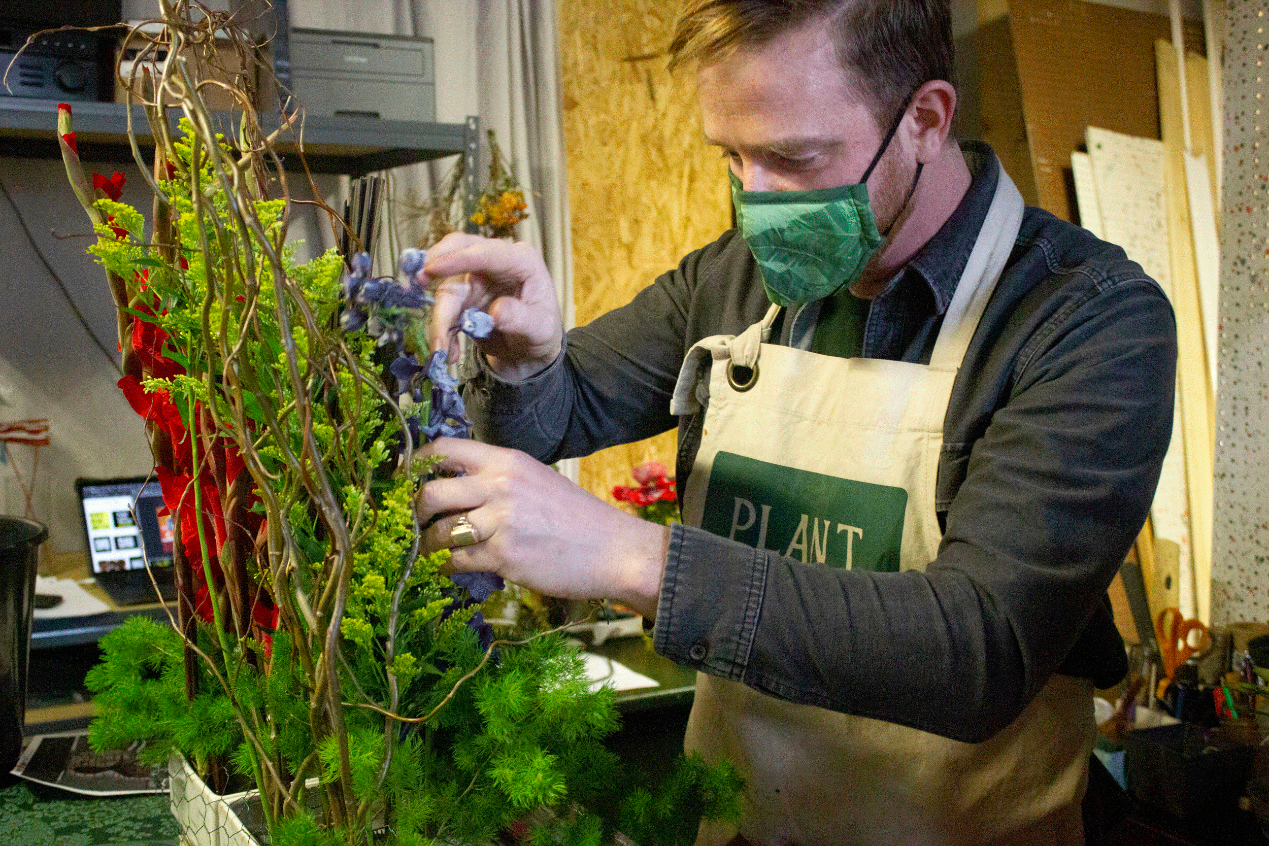
JS: I start by looking at the big picture: where will the arrangement sit? How will it be viewed? What kind of lighting is available? How are all the flowers going to stay fresh? How do I get the blossoms where I want? Floristry is first a technical art and without excellent mechanics, you can’t have a great arrangement. So once I have a solid plan then it is time for shopping!
What types of flowers did you use?
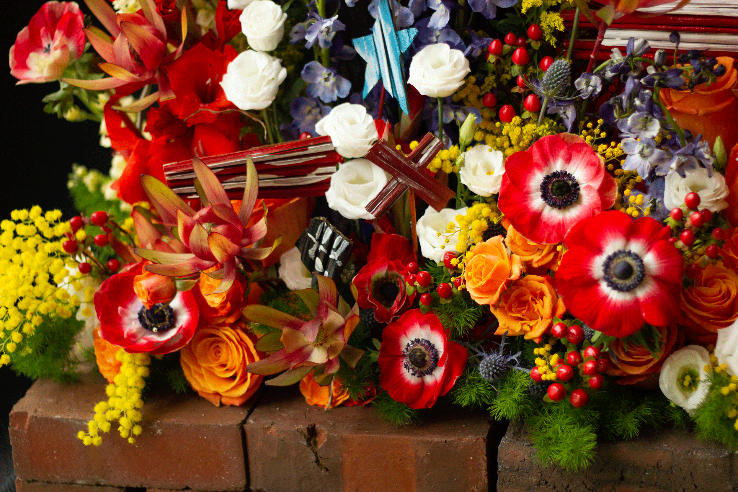
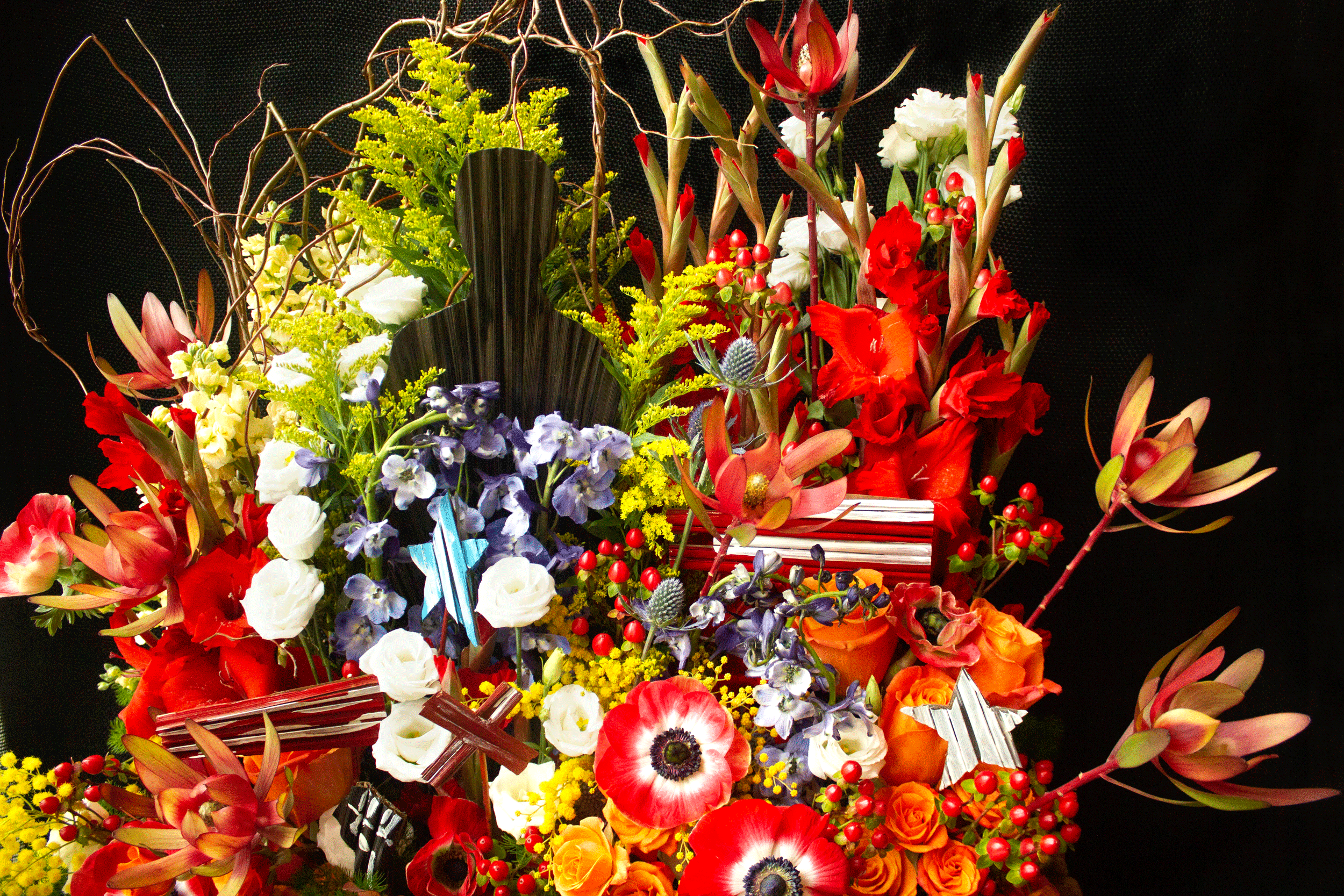
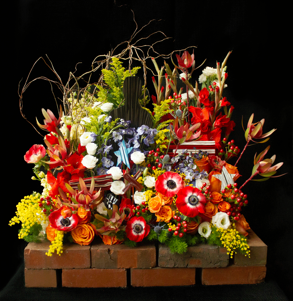
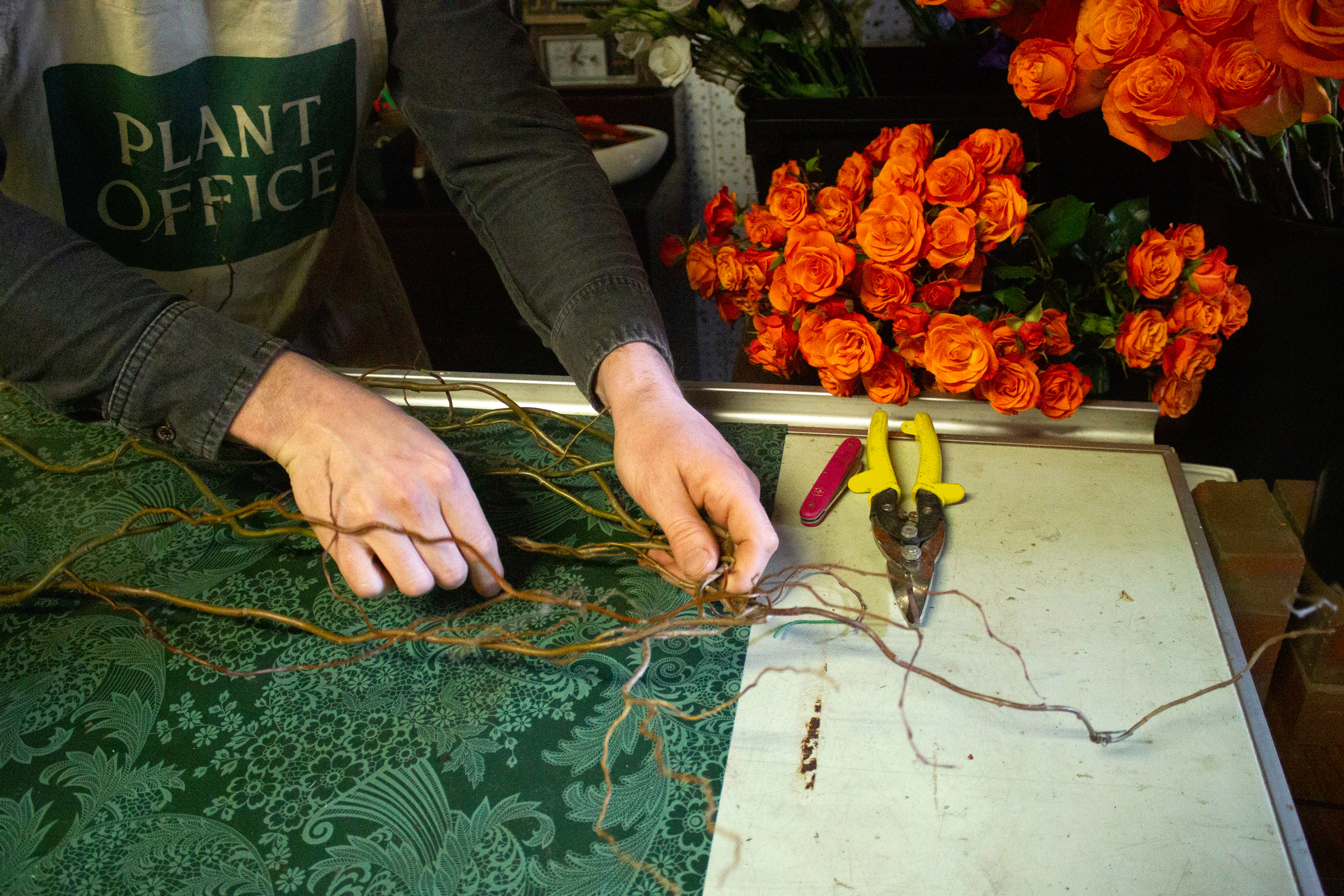
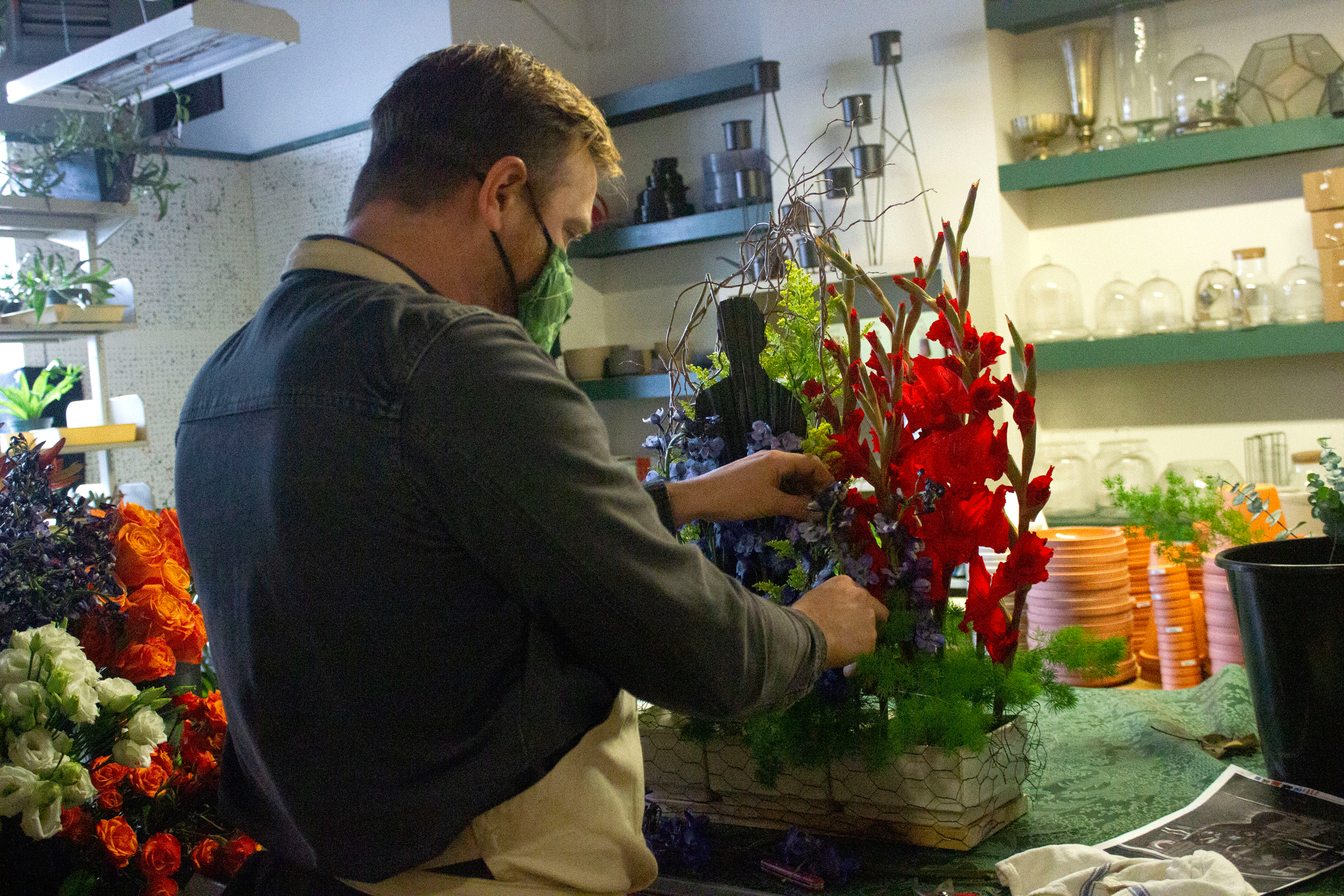
JS: I chose the flowers primarily for their color, quality, and overall shape. The background is red and orange gladiola, mustard curly willow, yellow solidago, orange roses, cream stock, and blue delphinium. I created the silhouette and graphic elements from large, dried palm leaves. Bringing in texture and interest are blue sea holly, red hypericum berry, yellow mimosa acacia, green ming fern, white lisianthus, and orange spray roses. I finished with red leucadendron and the stunning red and white anemone with dark blue centers.

What elements did you take inspiration from?
JS: It feels impossible to separate the composition from the meaning, as the canvas is marked with an “X’ referring to Malcolm X, bits of stars and stripes from the American flag, and the black silhouette of a person tucked in the planes of color. Mr. Driskell talked about how he wanted the painting to reflect the times, so in a nod to our present social climate, I included a raised Black fist, a symbol of the current Black Lives Matter movement. It seemed irresponsible to create something in the Now without dealing with the Now. I was also inspired by the flatness of the image. It is a representation of a mural on a brick wall in a city, and so I wanted to play with a low-relief, vertical composition.


“My favorite part [of the design process] is the act of creation. There is so much planning that goes into all of this, from the design to the mechanics to the supplies. But once I get to my workbench and there is a bank of beautiful fresh flowers next to me, then I know it’s time for a creative flow state, connecting my eyes and my hands and my emotions to the goals laid out for me. ”
Describe the steps for your process.
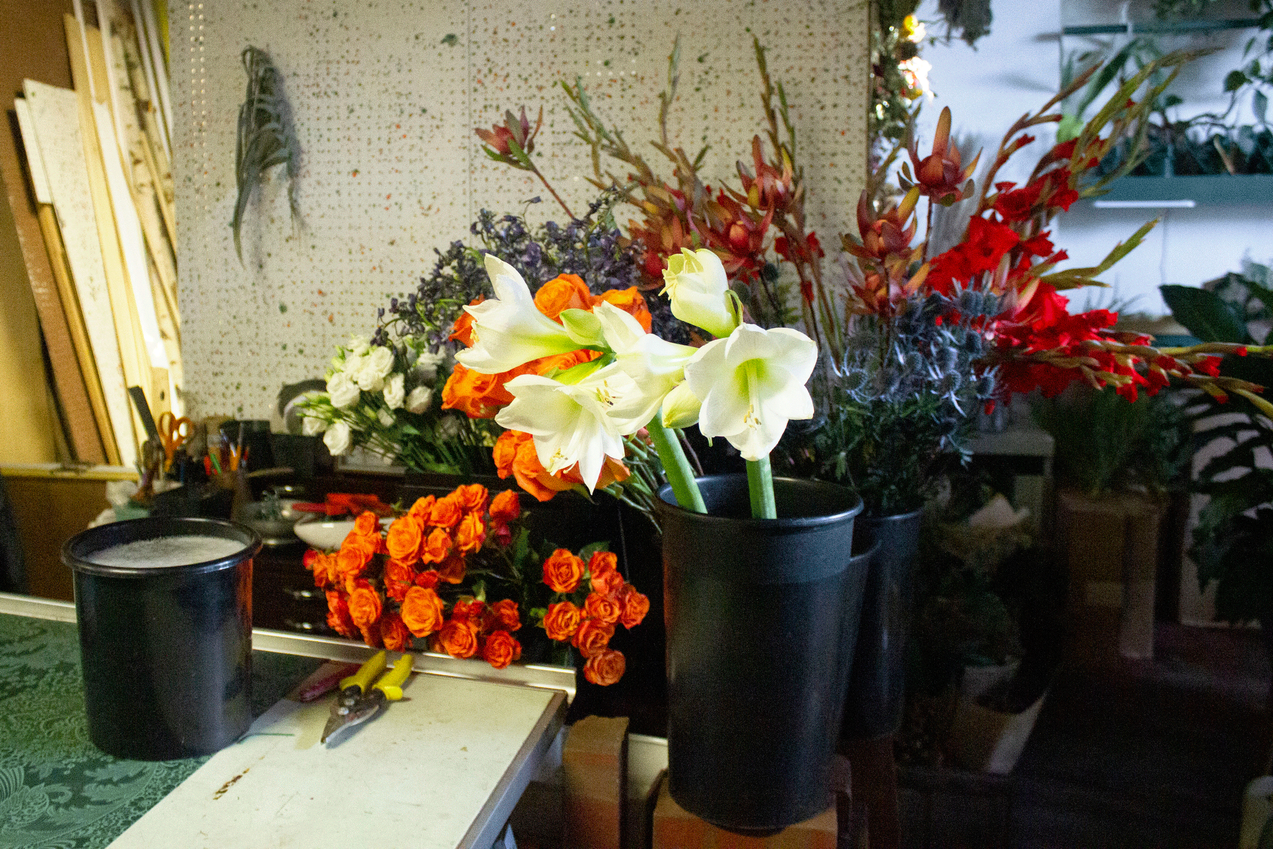
JS: Armed with a color palette and a budget, I made my way to the New England Flower Exchange, searching for flowers with the right colors and shape to meet my design. I tend to shop improvisationally and never quite know what my elements are going to be ahead of time. My response to Ghetto Wall #2 also had me looking for bricks and black fabric to complete the composition.
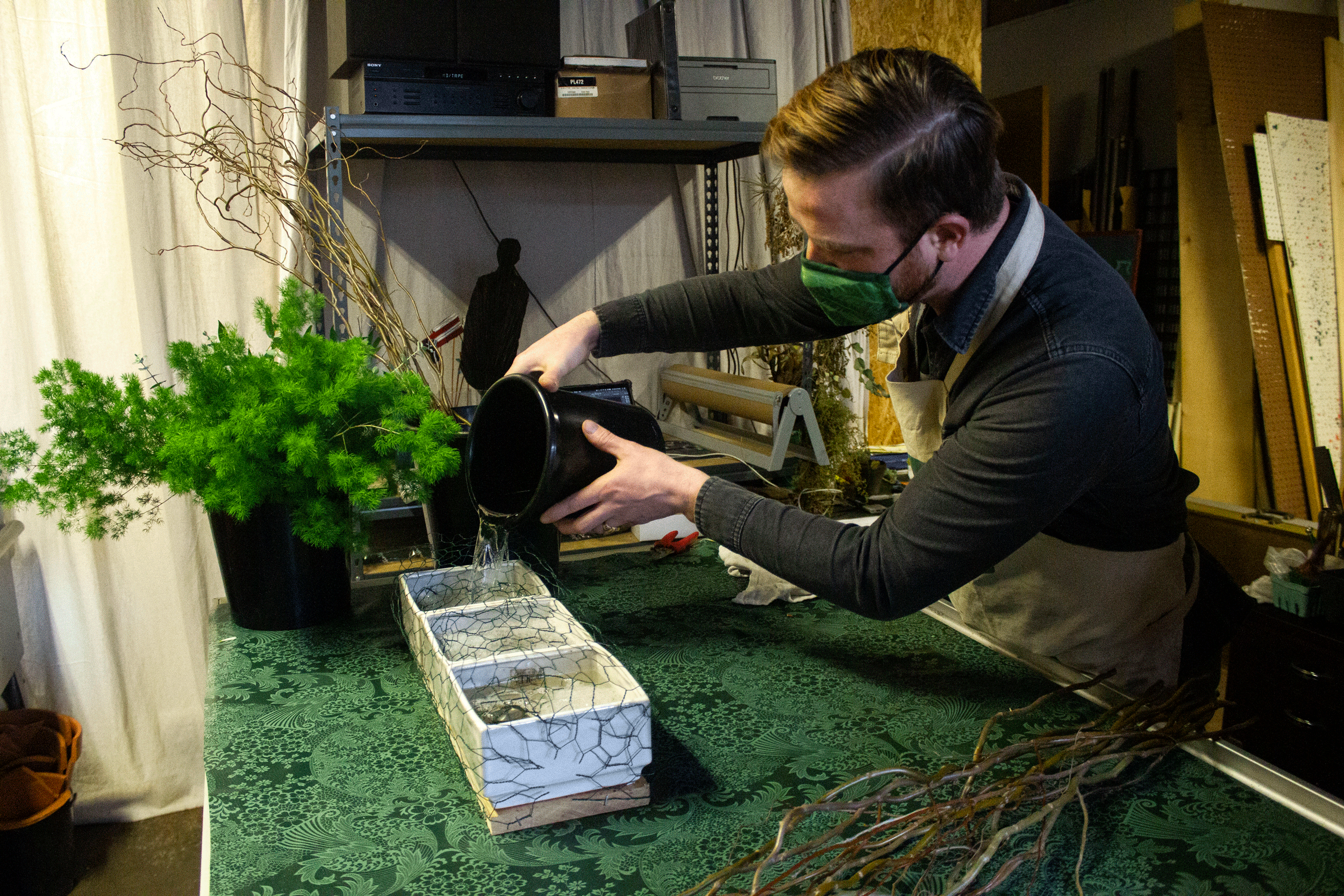
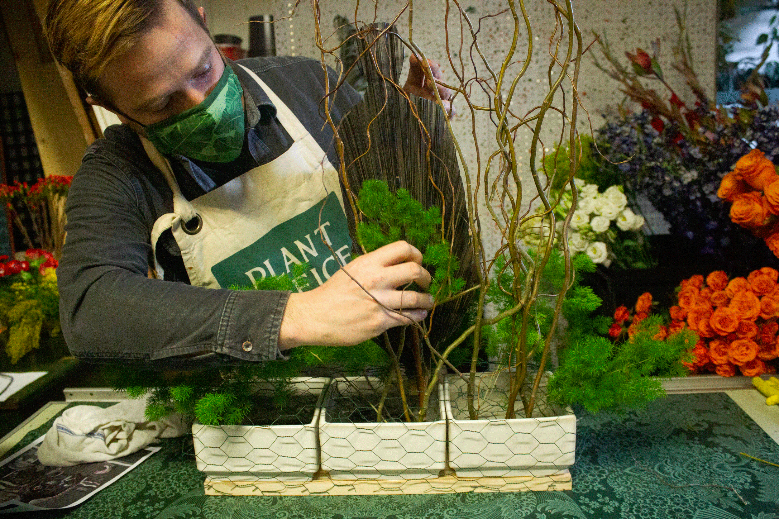
Once my materials are in place I start assembling the armature. This is the skeleton of the arrangement, often invisible but doing lots of the heavy lifting. I knew that I wanted a wide, shallow base, but I still needed the flowers to be supported vertically. So I took three low vases and affixed them side-by-side on a board. I affixed kenzan, or flower frogs, to the bottom and then layered chicken wire to create a stiff net for the stems.
After filling the vases with some water and flower food, the next step is to start “covering your butt.” I don’t want the chicken wire or vases to be visible, so adding a base of greenery helps cover it up, as well as provide extra support for the flowers.
In my planning, I created a map of the painting to guide me through the floral insertions, demarcating six visual layers. I knew that the black silhouette would be the focus and that it was the middle layer of the work, so I started by fitting that. From there I used masses of flowers to start blocking in the major color fields. Once I felt that the broad strokes were good I moved on to adding the graphic elements: the stars, stripes, the X, the BLM fist. Putting these in at this point ensured that they commanded their place in the piece, while also feeling integrated as opposed to stuck in as an afterthought.
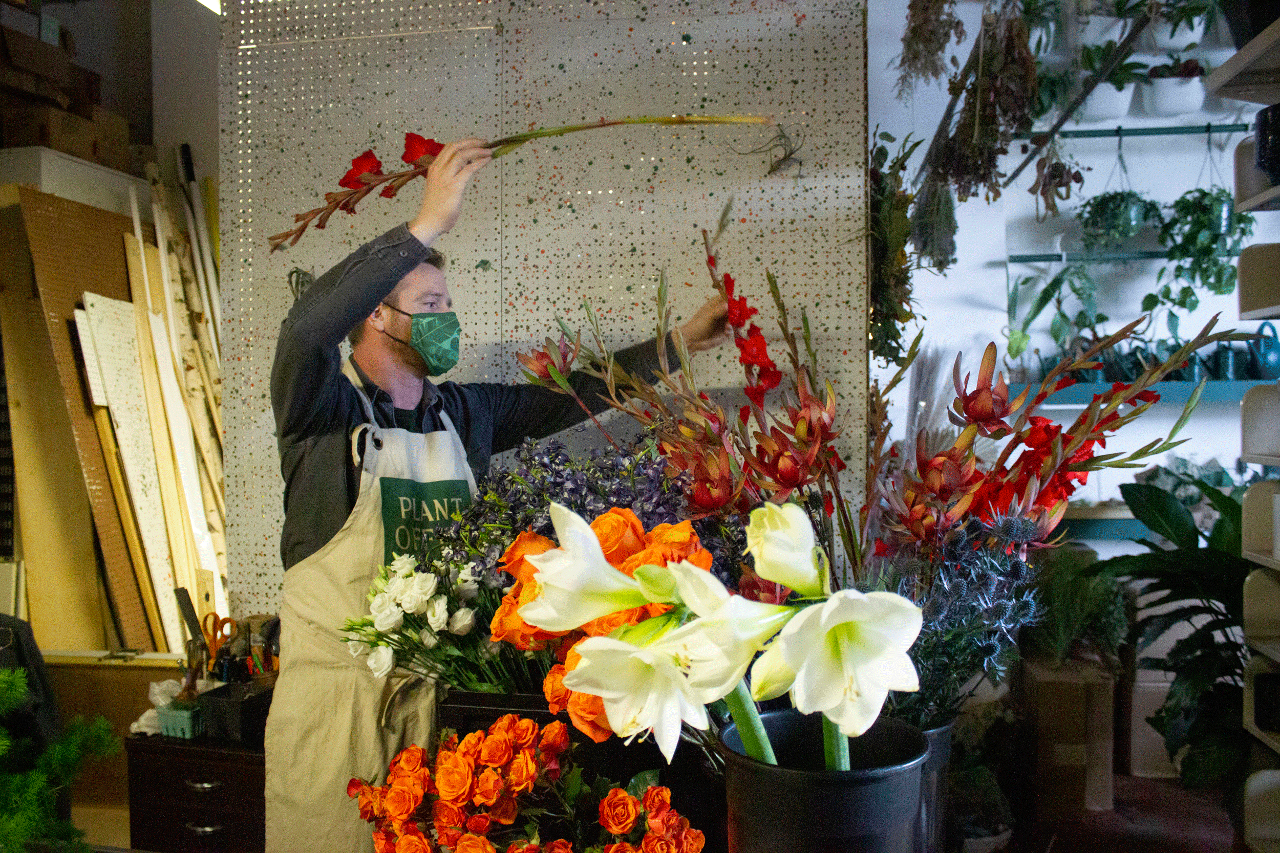
Once I was happy with the placement of the symbols, I went back through the arrangement with smaller flowers and textures to provide detail and to give subtlety to the color layering. Finally, I finished the piece with a few feature flowers, picking up on the graphic shapes from the painting and giving the piece some final pizzaz.
Until this point, I had been working on my workbench, but I knew I wanted the image against a black background. So I set up an area by my front window where the light is nice, hanging a black burlap background. Once I moved the arrangement in place I used bricks to cover my vases and finish the composition. Finally, it’s editing time: clipping out things that are in the way or dying, turning flowers to face the right direction, correcting the placement of the symbolic elements. Like in any creative practice, it is sometimes hard to know when things are done. It’s easy to edit-to-death, so you just have to learn how to trust your eyes and not let anxiety rule the process.